One art director, seven illustrators, two graphic designers, one UI/UX designer, and one UI/UX design and research lead (me)
Belong anywhere and everywhere, that is the heart of the Airbnb home and a big part of what makes it so special; it’s not a house or an apartment; a hotel or a condo; it’s a living, breathing piece of culture and personality. Airbnb reached out to SCAD to garther a curated team of designers and illustrators to illustration work infused with this philosophy.
Collaboration was key. As project manager, I was tasked to lead 8 skilled illustrators and 6 talented designers in expanding and enhancing Airbnb's library of illustrations with focus on inclusivity, diversity and storytelling.
The challenge? 60 illustrations that capture the sense of cultural diversity Airbnb is known for. Ambitions were high our team, excited to work with this client pushed the prompt much further using UX research and design.
As design lead, I focused on offerings that went beyond our client's expectations. My contributions were heavily centered around building UI/UX concepts that brought these illustrations to life, and helped make our client's daily lives a little easier. Tasks included building stakeholder map, creating hi-def prototypes and mock-ups, user journeys and a bunch of research!
When Jennifer Hom joined Airbnb as Art Director and Illustration Manager she discovered an opportunity to focus in celebrating diversity. Why? Because when she sought to reinvent the visual identity of the brand, she quickly found out a problematic and glaring reality--minorities had a hard time relating to Airbnb's illustrations. many felt underrepresented and excluded.
As Hom herself puts it: "...I’m just now seeing illustration pique interest in the tech industry. Companies are starting to understand its value—that the images can inform and delight their audience."
This is where we came in. SCAD + Airbnb was a collaboration project with the purpose of infusing storytelling elements into illustration and design work with the end-goal of creating concepts that educate hosts and guests about new and existing features of Airbnb in a delightful way.
A unique project calls for a unique approach. Getting eight illustrators to familiarize themselves with a new style was a full-time effort that meant little time and manpower left for research and ideation. As project manager, I decided to leverage those responsibilities amongst myself and the three other designers, and allow the illustrators to focus on their craft.
The research during this project was secondary, so I decided tone it down to the basics: secondary and primary research, organized through affinitization to uncover insights.
Our research helped inspire both the designers and illustrators in their work. The research methods varied from something as simple as pulling a drawing references of people, houses and places to conducting long-form interviews with both hosts and guests in Airbnb's current ecosystem.
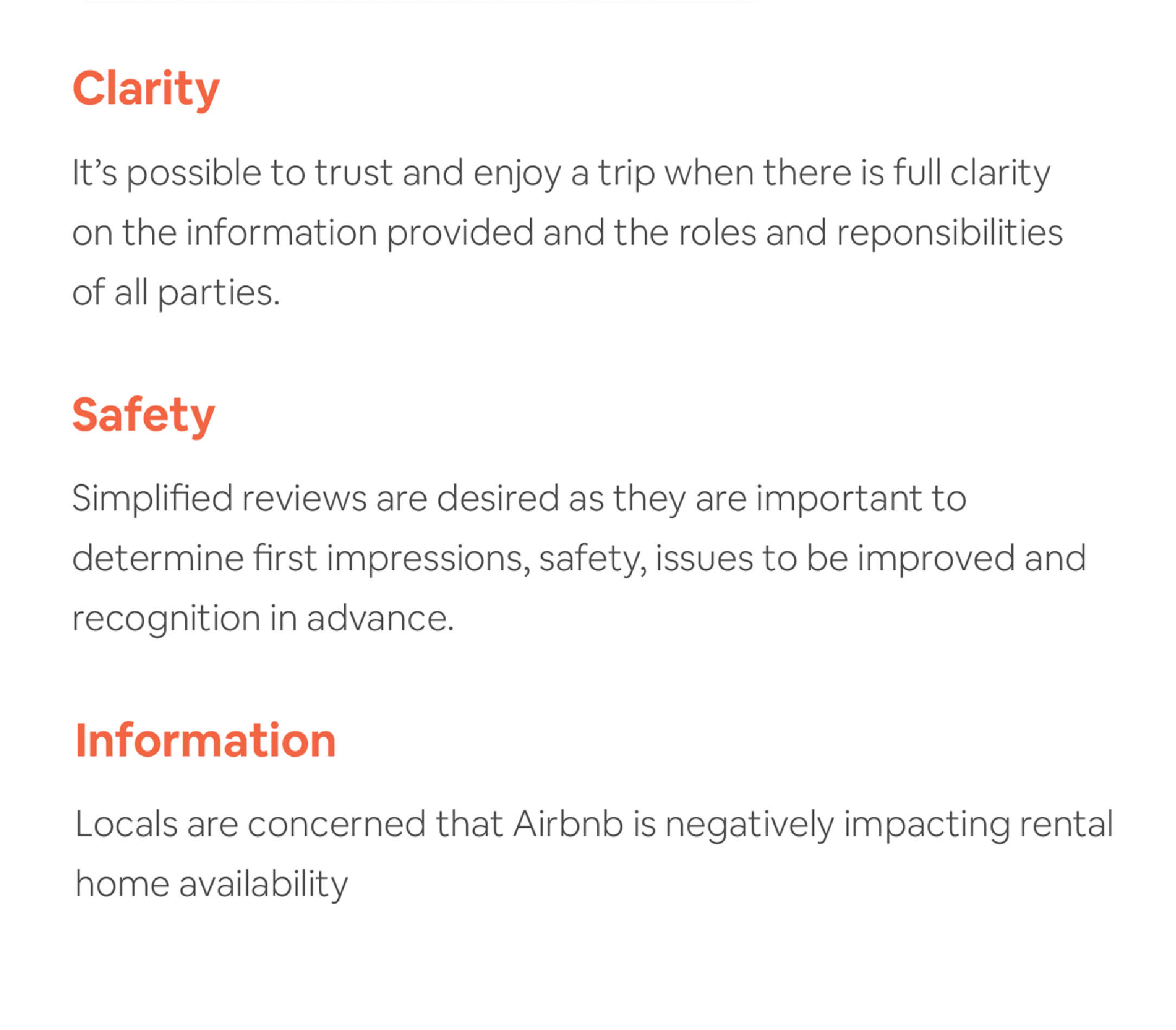
Our research accrued into...
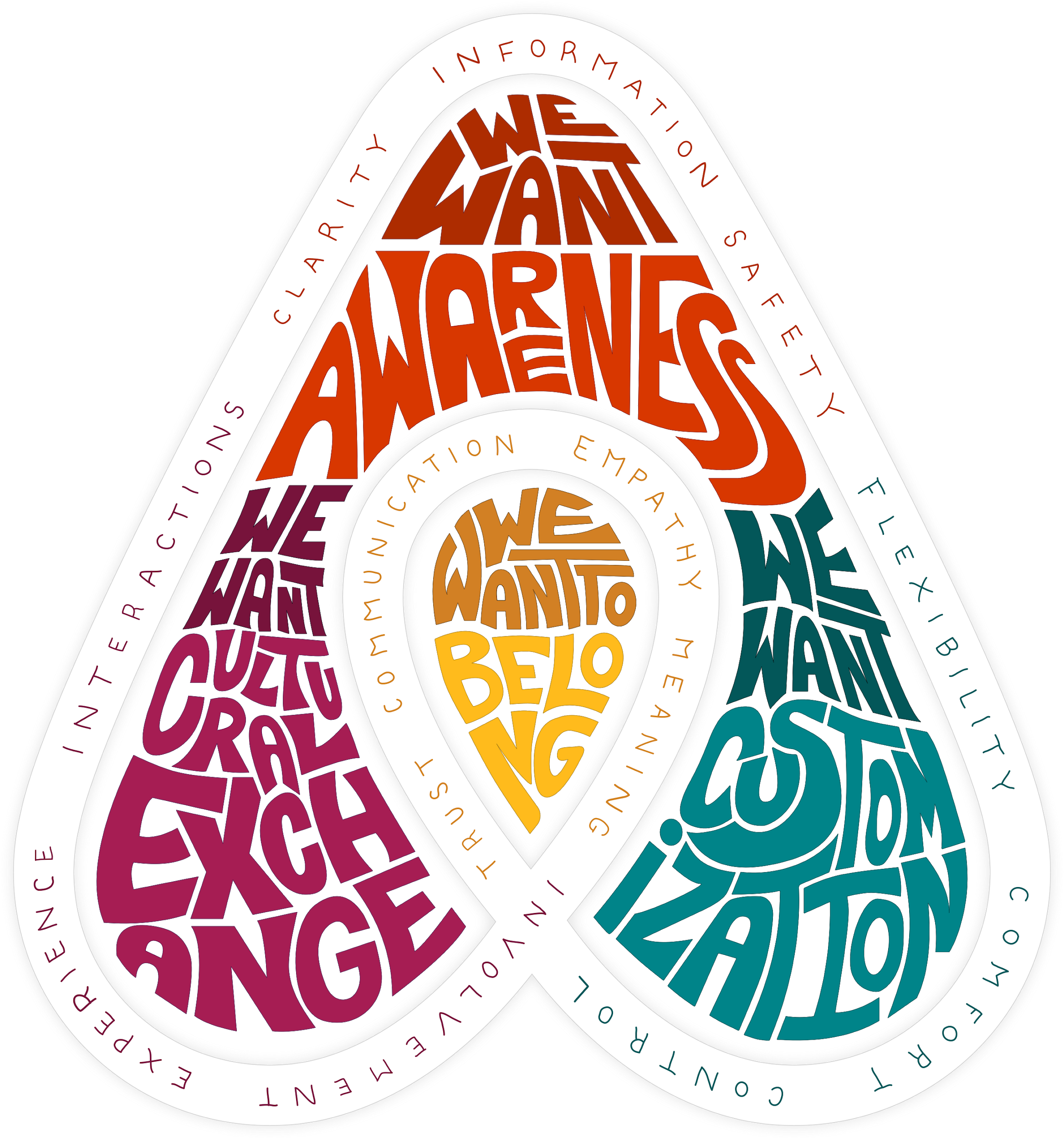
By organizing all that research we were able to build a comprehensive criteria for our ideas. This turned into a design framework which soon became a lens with which we designed extraordinary concepts with precision and creativity.
Following the client's request in this illustration project, our main deliverable was just that: polished vector illustration work. As project manager, I worked in tandem with Casey Nelson (a talented illustration lead and former senior story artist for Disney) in helping our team train themselves in Airbnb's style and deliver more than a 100 beautifully polished illustrations in only 10 weeks.
For more, please checkout the process book at the end of this page!
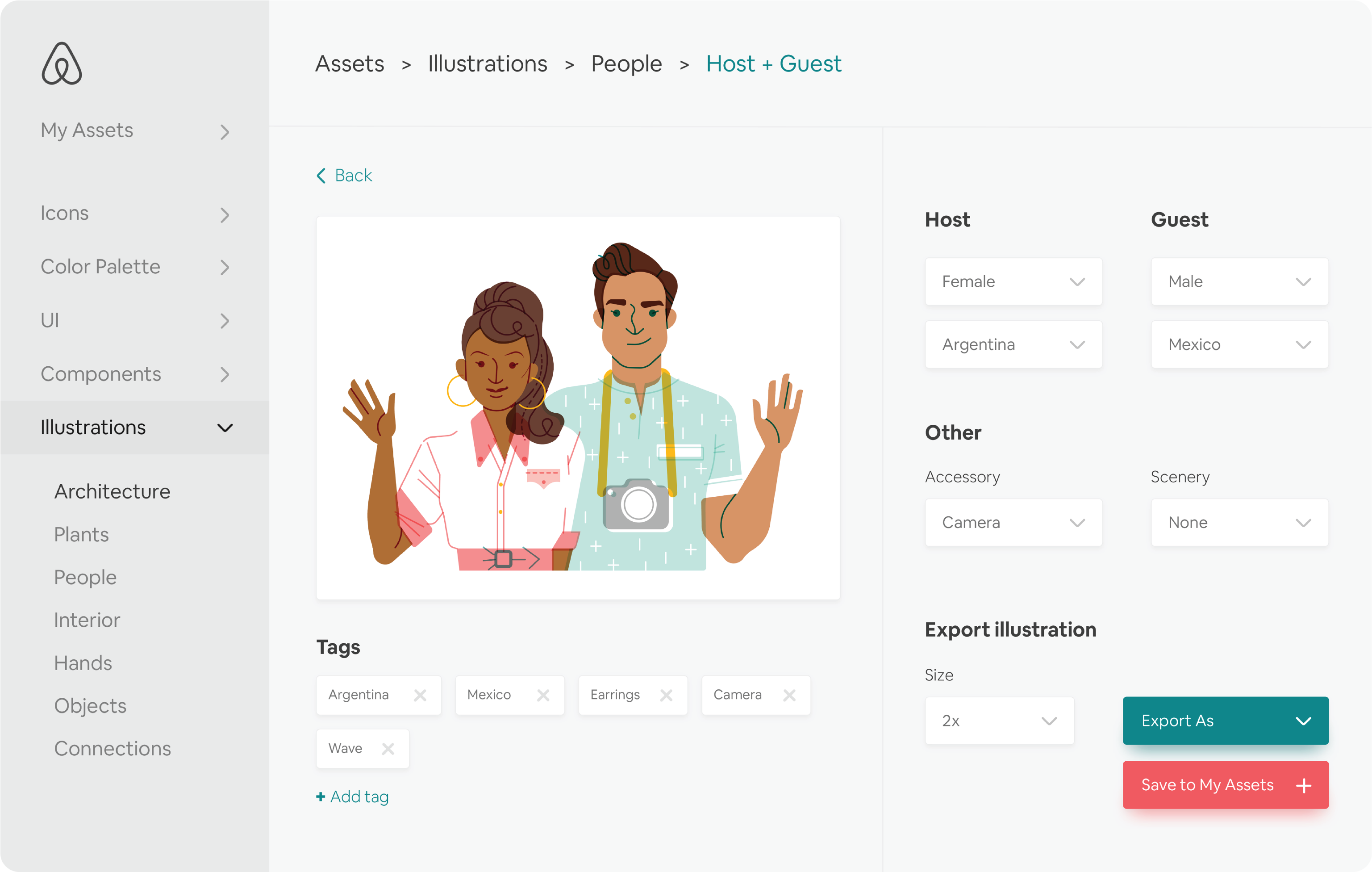
So, we delivered more than a 100 beautiful illustrations, but we didn't stop there. With a little bit of UX knowledge, we designed a library program to store, organize all existing and future vector-based work. Separated by categories, it offers a simple solution to plug in assets into all of Airbnb's channels quickly and efficiently.
Note-worthy features include the ability to select multiple assets at once, and a "My Assets" category that allows employees to bookmark their most frequently used illustrations for easy access at all times. We designed it to be seamless. It included drag-and-drop integrations with programs Airbnb frequent programs like Photoshop, Illustrator, Sketch, Figma and even e-mail.
Why deliver only a handful of illustrations, when you can build a system that produces infinite variations? As its biggest feature,we designed this program to be customizeable. By clicking on an image, you can easily edit the illustration; swapping out characters; changing accessories; even adding scenery. We also included the option to export the vector image in any size.
What's more, we envisioned how this program could be enhanced using Airbnb's community. By taking advantage of its inherent tagging system, we able to generate images automatically for each individual user connected to the Airbnb platform. Imagine traveling anywhere, and seeing both yourself and your host accurately represented on your phone screen. We wanted to create the ultimate celebration of diversity and culture, and tailor it to each person individually.
Airbnb starts with the on-boarding experience. Like any first impression, it can be pivotal in a user’s decision to commit to the platform. Following our research, we realized there was a missed opportunity to integrate Airbnb’s illustrations to the mobile platform. This is how we envisioned it could look embellished with these beautiful illustrations.
If your home is a reflection of your personality, what better way to create memorable stays than by matching hosts and guests with common interests? Imagine an art enthusiast backpacking through Europe stumbles into an Airbnb that feels like an art museum; imagine a gamer at an e-sports player’s condo, or a fishing fanatic in a boat house in New Orleans.
We even designed a rewards points system, where hosts can accumulate points for getting 5 star ratings and spend it on these branded Airbnb products. The purpose is to spread the brand, reward host’s performance and above all, brand and amenitize the Airbnb lodging experience.
As designers, we couldn't help ourselves, we took all these beautiful illustrations and made them physical. We wanted to see how far we could take it.
During the 10th week, we flew to Airbnb's headquarters in San Francisco and I presented this project to the clients. They loved it. The entire team agreed the quality was indistinguishable from their in-house work and gave us a standing ovation for those 10 weeks of hard work.
Since then we've been spotting some of our illustrations here and there.
Like what you see?
Checkout the process book I wrote and helped design!